1958 Power
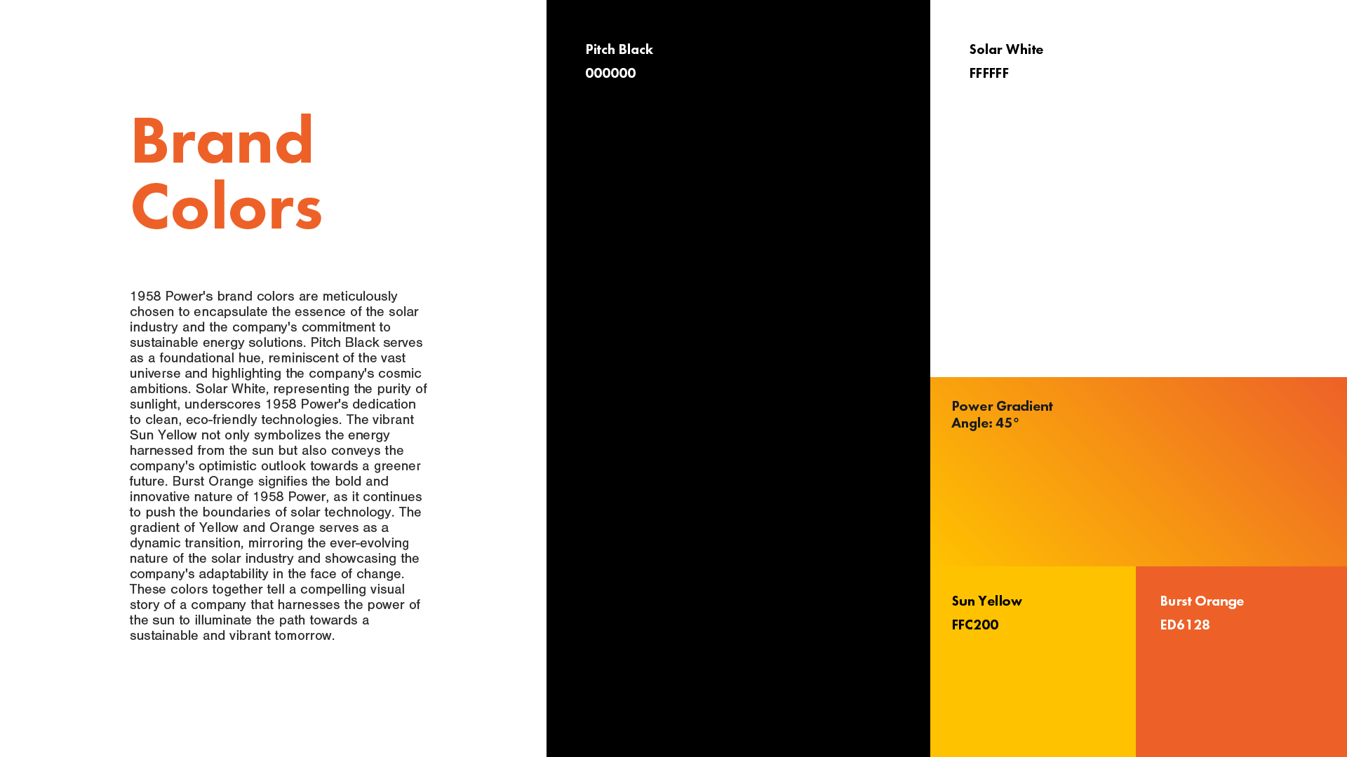
1958 Power is more than just a solar company in Arizona – it's a beacon of trust and innovation for homeowners looking to tap into the sun's potential. When they approached me, they had big dreams and a clear mission: to make solar solutions genuine, accessible, and top-notch. I dove right in, taking the challenge head-on. I designed a logo for them, a lightning bolt paired with bold letters, capturing their energy and determination. My color choices, from the deep black and fresh white to the pops of sunny yellow and vibrant orange, tell a story of professionalism and warmth. The fonts? Futura PT adds a modern edge, while Nimbus Sans keeps things grounded and readable. And it wasn't just about looks. I helped them voice their dedication to solar energy's benefits: savings, sustainability, and community. Through our collaboration, 1958 Power didn’t just get a brand; they got a story that resonates with every homeowner they meet.
Services :
Logo Design
Brand Mark Creation
Color Palette Development
Typography Selection
Brand Package Delivery
Website


